Design, Inspiration, Posters
Top Fonts to Use on Posters

Wait, so after all that time you spent creating incredible visuals, now you have to start hunting for creative fonts too?! We get it: choosing the right font for your poster can feel overwhelming, especially with thousands of typefaces out there. Your font choice shouldn’t just look good- it needs to stand out, remain legible, and fit seamlessly with your overall design. To help you skip the hassle, we’ve compiled a list of some of the best fonts to use for posters. Whether you’re going for a clean, modern look or something fun and expressive, there’s something here for every design style.
Here are some of the best fonts for posters you can use in your own designs:
Gilmer
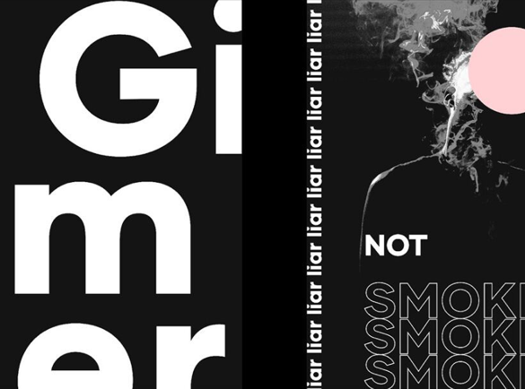
Classification: Geometric Sans Serif
If you need a fresh and clean font for your poster, try Gilmer by Piotr Lapa. This geometric sans serif font brings a futuristic edge that’s perfect for modern, minimalist poster designs.
How to use it
Gilmer works well for both headings and body text. Its clarity and balance make it ideal for informative posters, flyers, booklets and other printed materials where readability is key.
Brandon Grotesque
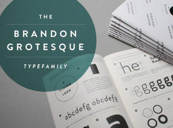
Classification: Sans Serif
Created by Hannes von Döhren, Brandon Grotesque is inspired by the sans serif fonts of the 1920s and 1930s. It blends vintage charm with a contemporary twist. Its slightly rounded corners give it a warm, approachable feel without sacrificing professionalism.
How to use it
Brandon Grotesque is highly versatile: use it for titles, subtitles, or body copy. It’s a strong choice for promotional posters and event materials.
League Gothic
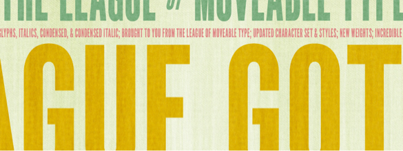
Classification: Sans Serif
League Gothic is a revival of Alternate Gothic #1, originally created in 1903 by Morris Fuller Benton. This updated version, from The League of Movable Type, has a tall, slender structure with serious visual impact.
Due to its narrow and bold appearance, League Gothic shines in titles and subtitles but isn’t ideal for long body text.
How to use it
Pair it with a handwritten or brush-style font to create a striking contrast.
Aleo
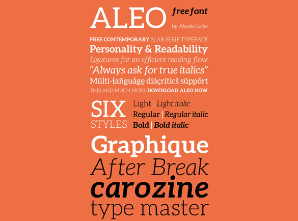
Classification: Slab Serif
Designed by Alessio Laiso, Aleo offers a bold slab serif style with a soft, rounded touch. It comes in three weights and includes italicized versions, giving you flexibility in your design.
How to use it
Aleo’s high readability makes it a great choice for both titles and body text: especially for posters with a casual or friendly tone.
Coldiac
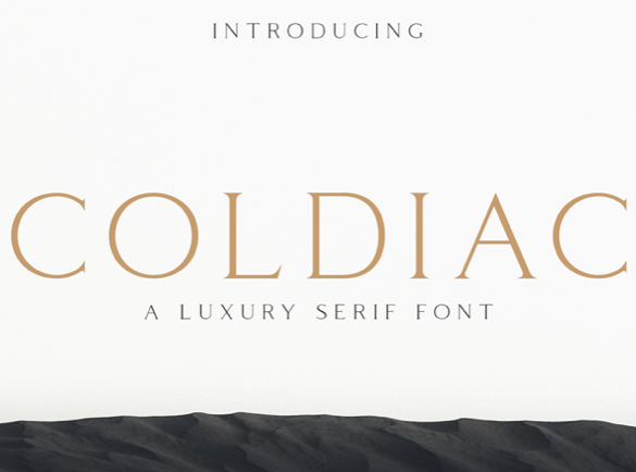
Classification: Serif
Coldiac is a luxurious serif font with thin strokes and square-like shapes, giving it an upscale, balanced aesthetic.
How to use it
Because it’s an all-caps font, Coldiac is best used for short titles, headers, or short callouts – not for paragraphs or body text.
Glamor
Classification: Serif
For a high-fashion look, go with Glamor by Henrick Ronaldez. This elegant serif typeface features subtle ball terminals, echoing the refined style of fonts like Didot and Bodoni.
How to use it
Glamor is ideal for luxury-focused posters, especially for fashion or lifestyle brands. Due to its decorative nature, keep it to headlines and short text.
Originals
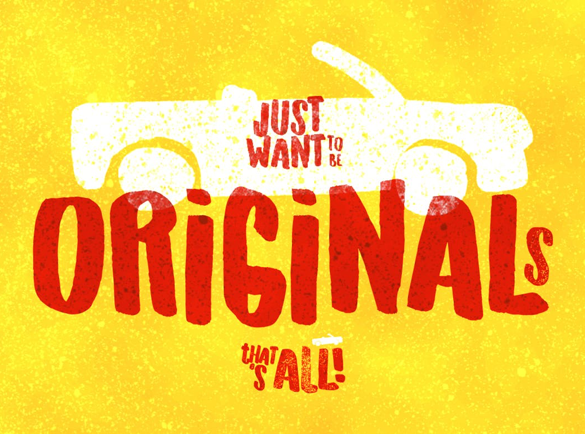
Classification: Brush Font / Display Font
Looking for a handmade vibe? Originals is a display font that mimics brush pen or felt-tip marker strokes – no need to draw your own.
How to use it
Its playful and expressive style makes it perfect for posters related to schools, kids, or entertainment. You can also use it on signs, or postcards.
Lavanderia
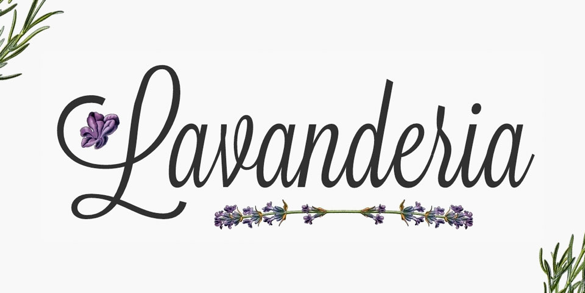
Classification: Script Font
Lavanderia by James T. Edmonson is a stylish script inspired by laundromat window signage in San Francisco’s Mission District. It’s elegant without feeling like traditional wedding calligraphy.
How to use it
Lavanderia works best for titles and headers. It’s especially suited for cozy-yet-classy environments like restaurants, boutique hotels, or lifestyle venues.
Even if fonts look similar at first glance, each one has its own unique personality. Choose the typeface that best fits the tone and message you want to convey. Whether you’re creating a modern event flyer or a playful school poster, the right font can elevate your entire design.
So what are you waiting for? Start creating stunning posters with these standout fonts!